Zofia Zimare
All selected work
SPIC AND SPAN / RESPONSIVE BOOKING

A clearer way to book
cleaning services.

I designed a responsive booking experience from research through implementation, partnering with a developer.

My role
Sole UX & UI designer
Collaboration
Partnered with a developer
Outcome
Launched booking experience
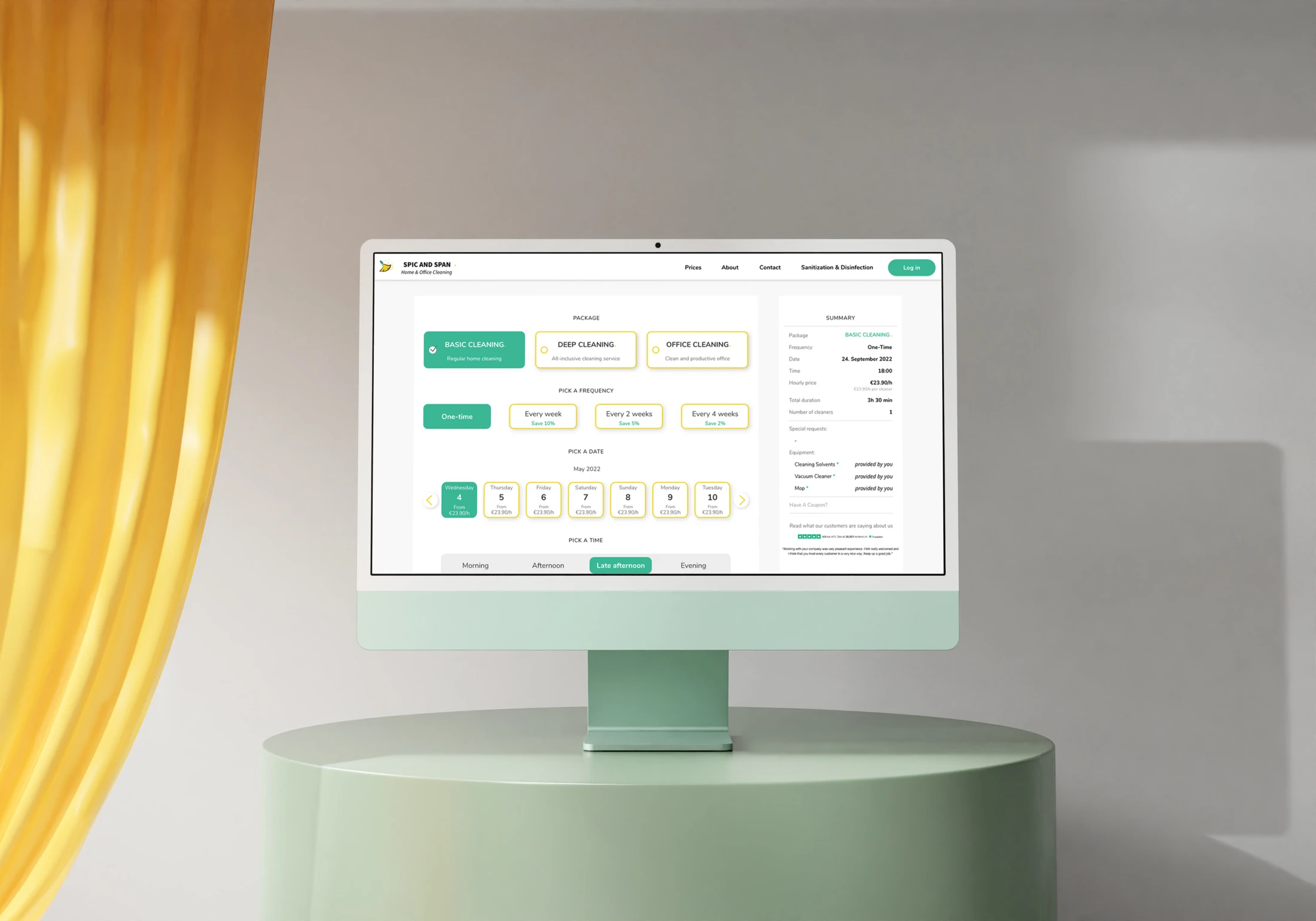
SPIC AND SPAN booking experience on desktop
01 / THE CHALLENGE

A booking is a series of connected decisions.

Customers need to choose a service, understand what it includes, provide property details, and configure a time and team. As the form grows, keeping the overall booking clear becomes a design problem of its own.

I conducted competitive analysis, interviews and usability testing with five participants, followed by persona and user-flow work. I owned the design and collaborated with a developer through launch.

02 / DISCOVERY

Find the choices that create uncertainty.

Testing of the earlier form identified unclear cleaning packages and pricing, uncertainty around the number of cleaners and duration, and ambiguity about AM/PM. Participants also missed equipment requirements and the property-size slider.

These findings gave the booking problem a concrete shape: the experience needed to make choices, requirements, and the current configuration easier to understand.

The original research summary documents usability issues identified with five participants.
01

Structure the journey before styling the fields.

I mapped the service, property, equipment, scheduling, and personal-information choices as a complete flow. That connected each section to the customer’s overall goal and made the sequence of decisions explicit.

The user flow connects service and property details with scheduling and booking.
02

Make choices easy to scan.

Selection cards and recognizable sections give the form a visible structure. Service types, frequency, and equipment choices use consistent treatments, helping people distinguish an action from supporting information.

03

Keep the booking in view.

The desktop layout places a booking summary next to the main form. Customers can refer to their configuration while continuing through the experience, without holding every earlier choice in memory.

04

Carry the hierarchy into mobile.

The mobile design reorganizes the same journey into a narrow, stacked layout. The selection patterns and section hierarchy remain recognizable as the form adapts to the smaller screen.

Desktop and mobile booking layouts, with consistent selection patterns and a booking summary.
The booking experience across service configuration and subsequent screens.
05

Create consistency across the form.

The style guide establishes color, typography, and interface treatments. Reusing those decisions throughout the journey keeps the experience coherent as the type and amount of information changes.

The project’s visual style guide: color, typography, and interface treatments.
04 / LAUNCH & REFLECTION

From research to a shipped experience.

The project delivered a responsive booking flow, a visual style guide, and desktop and mobile interfaces. I worked directly with a developer to bring the experience to launch.

It demonstrates my ability to own an entire consumer journey in a small team: understand the problem, establish a flow, resolve the interface details, and collaborate through implementation.

WHAT I TAKE FORWARD

A form becomes easier to understand when the whole decision is clear—not just each individual field.
NEXT PROJECTLionbridge Content RemixView case study